
2026 STARS AWARDS | AWARD-WINNING ASSOCIATE LOGO
THE REAL ESTATE STUDIO LOGO SYSTEM
A flexible visual system designed to express who we are and create consistency across every Studio experience.
2026 STARS AWARDS | AWARD-WINNING ASSOCIATE LOGO
A flexible visual system designed to express who we are and create consistency across every Studio experience.
A brand begins shaping expectations before a conversation ever takes place. It influences how a company is perceived, remembered, and trusted across every interaction that follows.
When creating The Real Estate Studio identity, we needed a system that reflected our hospitality-first philosophy and our belief that luxury is a feeling, not a price point. The logo system needed to feel refined without becoming unapproachable, distinctive without becoming ornamental, and structured enough to support the many ways people experience The Real Estate Studio.
From residential brokerage and new homes to builder and developer partnerships, property marketing, signage, print, and digital experiences, the logo was designed to bring clarity and continuity to every touchpoint.
A real estate brand must work across an unusually wide range of environments. It may appear on a mobile screen, a property sign, a community presentation, a printed lookbook, or the materials that welcome a client into the next stage of their journey.
The Real Estate Studio logo system was created with that range in mind. Each expression belongs to the same visual family while providing the flexibility needed to respond to different formats, audiences, and applications.
The result is a brand that can evolve with the company without losing the recognition and consistency at its foundation.
A real estate brand must work across an unusually wide range of environments. It may appear on a mobile screen, a property sign, a community presentation, a printed lookbook, or the materials that welcome a client into the next stage of their journey.
The Real Estate Studio logo system was created with that range in mind. Each expression belongs to the same visual family while providing the flexibility needed to respond to different formats, audiences, and applications.
The result is a brand that can evolve with the company without losing the recognition and consistency at its foundation.
A real estate brand must work across an unusually wide range of environments. It may appear on a mobile screen, a property sign, a community presentation, a printed lookbook, or the materials that welcome a client into the next stage of their journey.
The Real Estate Studio logo system was created with that range in mind. Each expression belongs to the same visual family while providing the flexibility needed to respond to different formats, audiences, and applications.
The result is a brand that can evolve with the company without losing the recognition and consistency at its foundation.

Alternate logo configurations allow the logo to respond to vertical, horizontal, compact, and space-limited applications. These variations are not separate logos. They are carefully structured expressions of the same logo, governed by shared typography, spacing, proportion, and visual hierarchy.
By planning for different applications from the beginning, the system helps protect the integrity of the brand wherever it appears.
Typography plays an important role in how The Real Estate Studio communicates. It creates hierarchy, establishes tone, and helps information feel considered and easy to navigate.
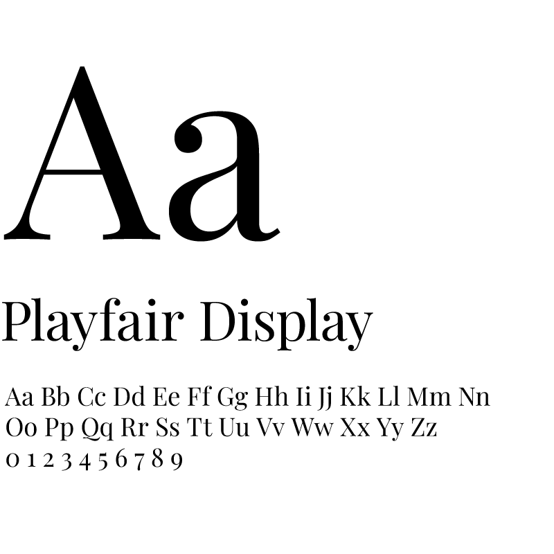
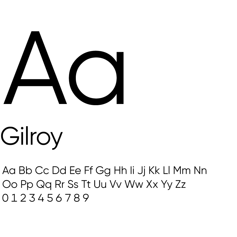
Playfair Display brings an editorial quality to headlines and signature moments. Gilroy provides modern clarity and readability across supporting content, digital experiences, and everyday communication.
Together, the typefaces balance personality and function. They allow the brand to feel elevated while remaining welcoming, accessible, and clear.
The Real Estate Studio system provides a consistent foundation for property presentation, community marketing, digital content, signage, client communication, recruiting, and the materials used throughout a real estate journey.
That consistency helps each interaction feel connected to the one before it. Whether someone is discovering The Studio online, viewing a property, exploring a new-home community, or meeting with our team, the visual experience reinforces the same standard of care.
The Real Estate Studio logo received two honors in 2026:
2026 NCHBA STARS Award, Best Logo for an Associate
2026 MAME Award, Best Logo for a Company
While the category names differ, both awards recognize the same comprehensive logo system.
For our team, the recognition affirms the value of building a brand as a connected, adaptable experience rather than treating a logo as an isolated design.

The Real Estate Studio identity represents more than how the company looks. It reflects the care, clarity, and hospitality we seek to bring to every relationship and experience.
Whether you are buying, selling, building, developing, or considering your next professional chapter, we invite you to discover what makes The Real Estate Studio different.