2026 MAME Awards
Best Logo For A Company
The Real Estate Studio | Raleigh, North Carolina
2026 MAME Awards
The Real Estate Studio | Raleigh, North Carolina
We believe that a brand is not decoration; it is a discipline. Most firms focus on the transaction; we focus on the identity that makes the transaction possible. We have built a visual world defined by structure, restraint, and an obsession with detail. This presentation is a look behind the curtain at the systems we’ve built to ensure that, whether you are an agent, a builder, or a partner, your brand is protected by a framework of excellence that never wavers.
Our logo is our signature, a mark of architectural permanence. In a crowded market, consistency is the fastest way to build trust. We’ve developed a responsive logo system that ensures we look as prestigious on a smartphone screen as we do on a ten-foot construction sign. It is a flexible identity designed to scale without ever losing its soul.
The Real Estate Studio logo reflects our founding philosophy: luxury is not a price point, but a feeling. We avoid ornamental excess to communicate clarity and market authority. These are qualities more common in boutique hospitality than transactional real estate. This provides a sophisticated foundation that instantly signals that the project is in expert hands.
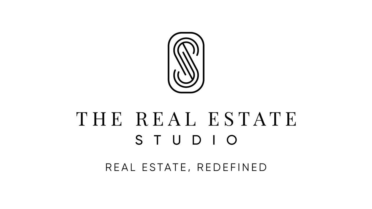
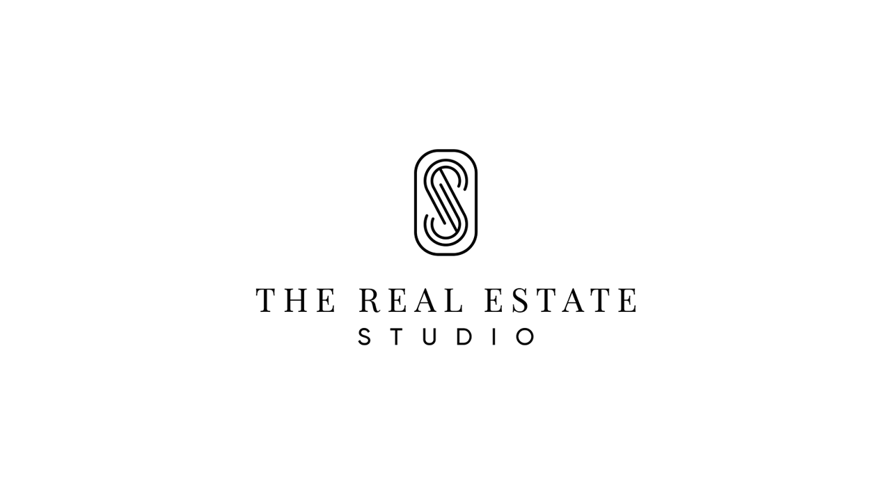
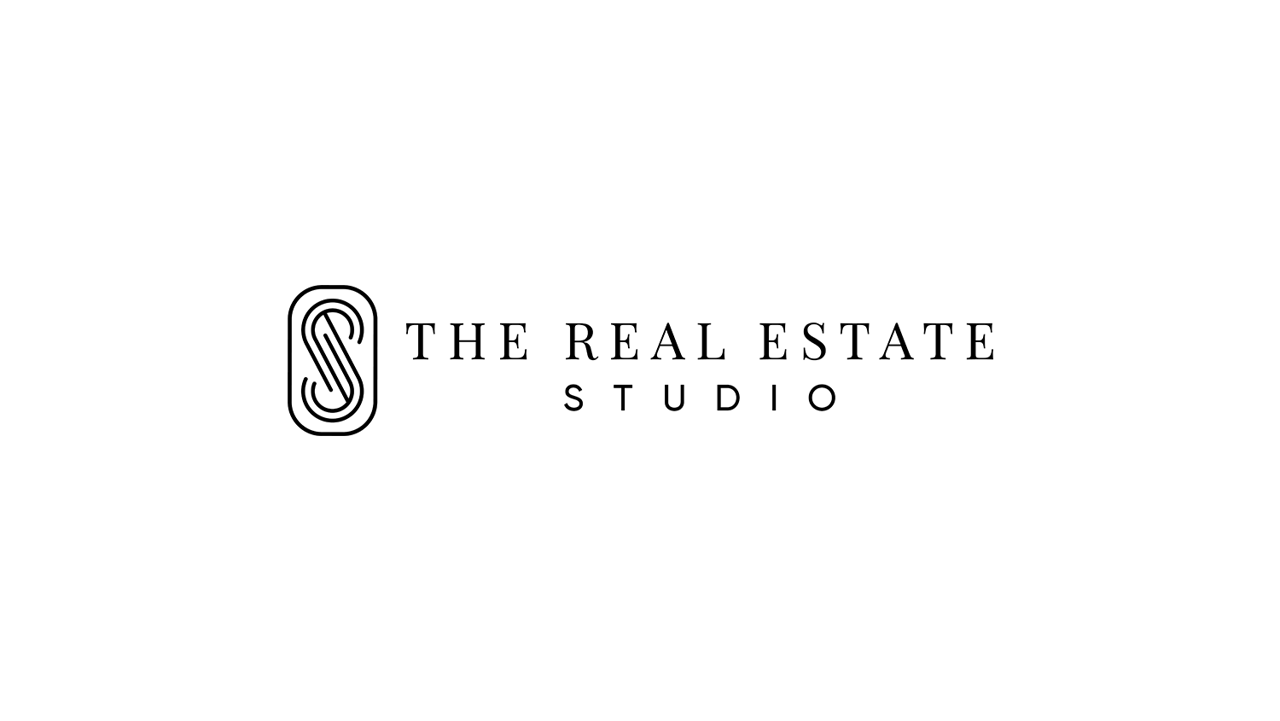
A modern brand must be responsive to its environment. We utilize a suite of alternate expressions to ensure our identity feels integrated into every space, from high-fidelity digital interfaces to physical signage. These alternates are not deviations; they are governed extensions of the same structural rules. This allows us to maintain brand integrity across any application without ever sacrificing the sophisticated hierarchy that defines us.

We view our typography as a structural asset, not a decorative one. Just as an architect chooses materials for their permanence and tone, we use a disciplined typographic system designed to instantly elevate the brands of our partners and the story behind every property we represent. We move away from the cluttered look of standard real estate brands to ensure that every word we publish carries the weight of a premium brand.
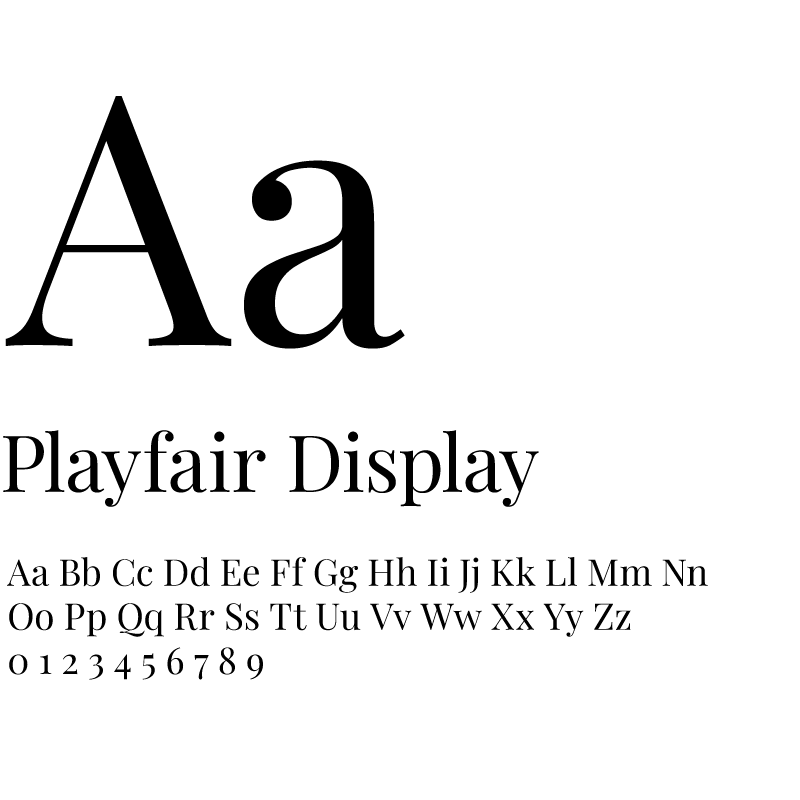
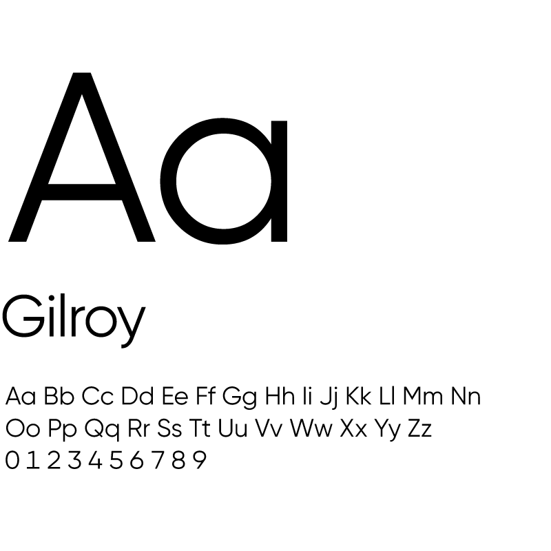
Our system balances the editorial elegance of Playfair Display with the modern, architectural precision of Gilroy. We intentionally moved away from trendy elements to establish visual authority and create a Lifestyle Journal aesthetic that ensures our visual language feels curated, expensive, and intentional.
Begin a tailored, strategic, and hospitality-driven real estate experience designed around your goals.